Quick Answer
The Premier Jumping League launched a new global identity created by NOT Wieden+Kennedy to modernize equestrian jumping and position it as a high-intensity world-class sport.
Cultural Context: A Premium Sport With an Outdated Image
Equestrian jumping has long carried prestige, heritage, and elite competition status. Yet despite its athletic demands and global audience potential, the sport has often struggled to present itself in a contemporary way.
For many outside the category, jumping can feel inaccessible, sponsor-heavy, and visually fragmented. The intensity of the sport—the courage, rivalry, and split-second precision—has often been overshadowed by traditional presentation codes.
This creates a familiar challenge in modern sports marketing: when the product is compelling, but the packaging fails to communicate it.
The launch of the Premier Jumping League represents an attempt to close that gap.
Insight: The Sport Already Had Drama—It Needed Better Framing
The strategic insight behind the identity is clear: jumping did not need reinvention, it needed revelation.
At its core, show jumping contains many of the ingredients modern audiences value in elite sport:
- Speed and precision
- Human-animal partnership
- High stakes and prize money
- Visual tension and risk
- Split-second outcomes
Rather than borrowing codes from other sports, the branding uncovers what was already present but underleveraged.
This is a critical distinction. The strongest rebrands do not fabricate relevance—they reveal it.
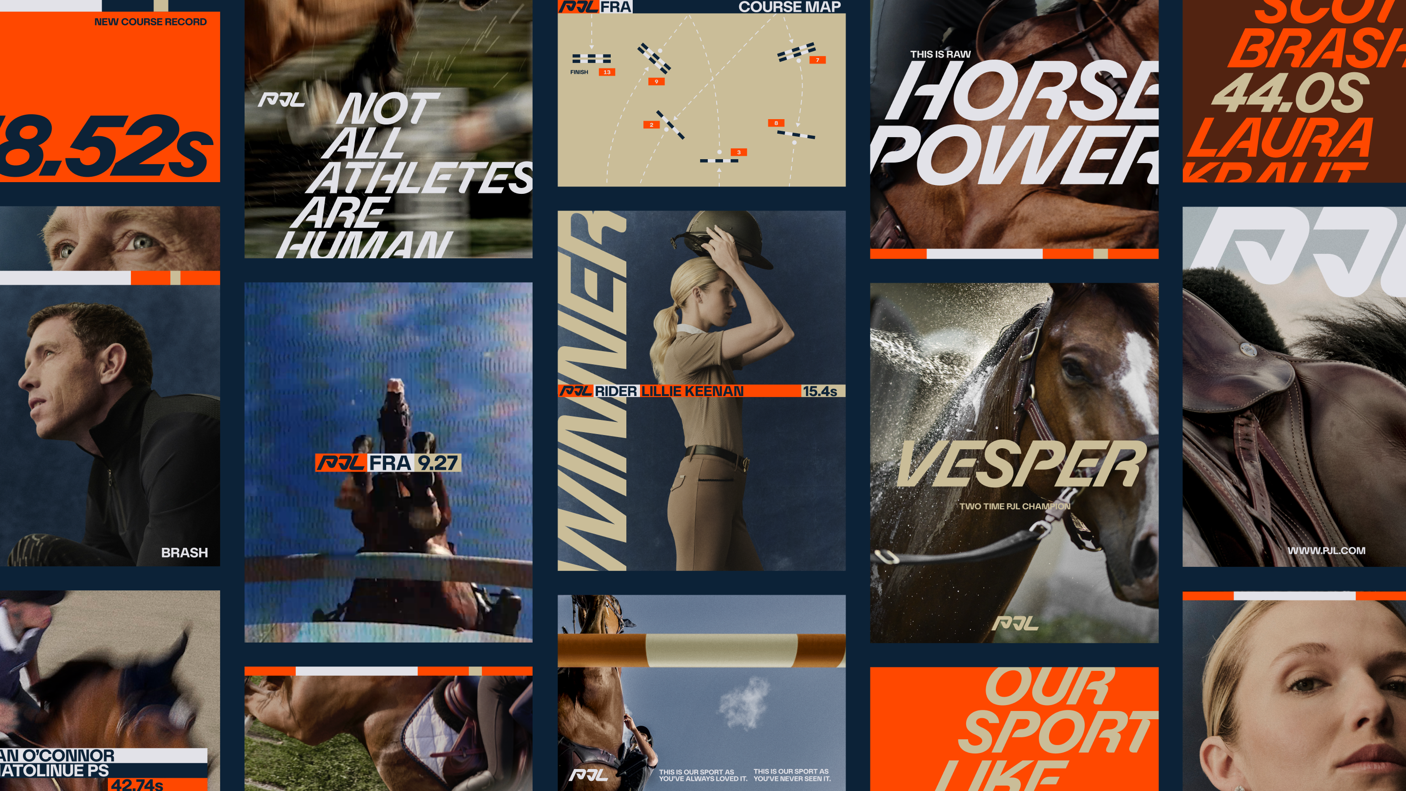
Brand Strategy: Owning the Most Recognizable Asset in the Arena
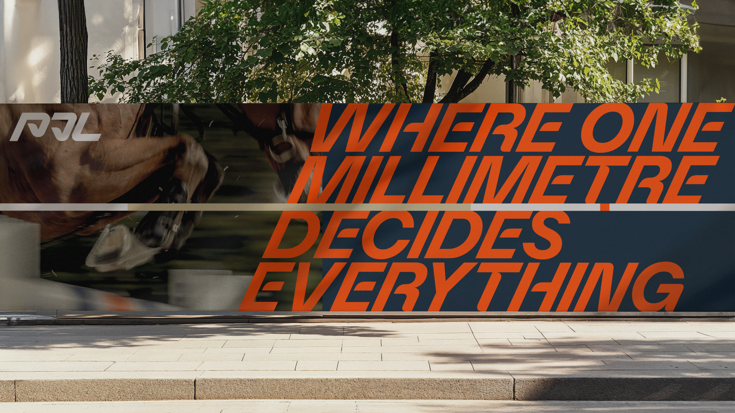
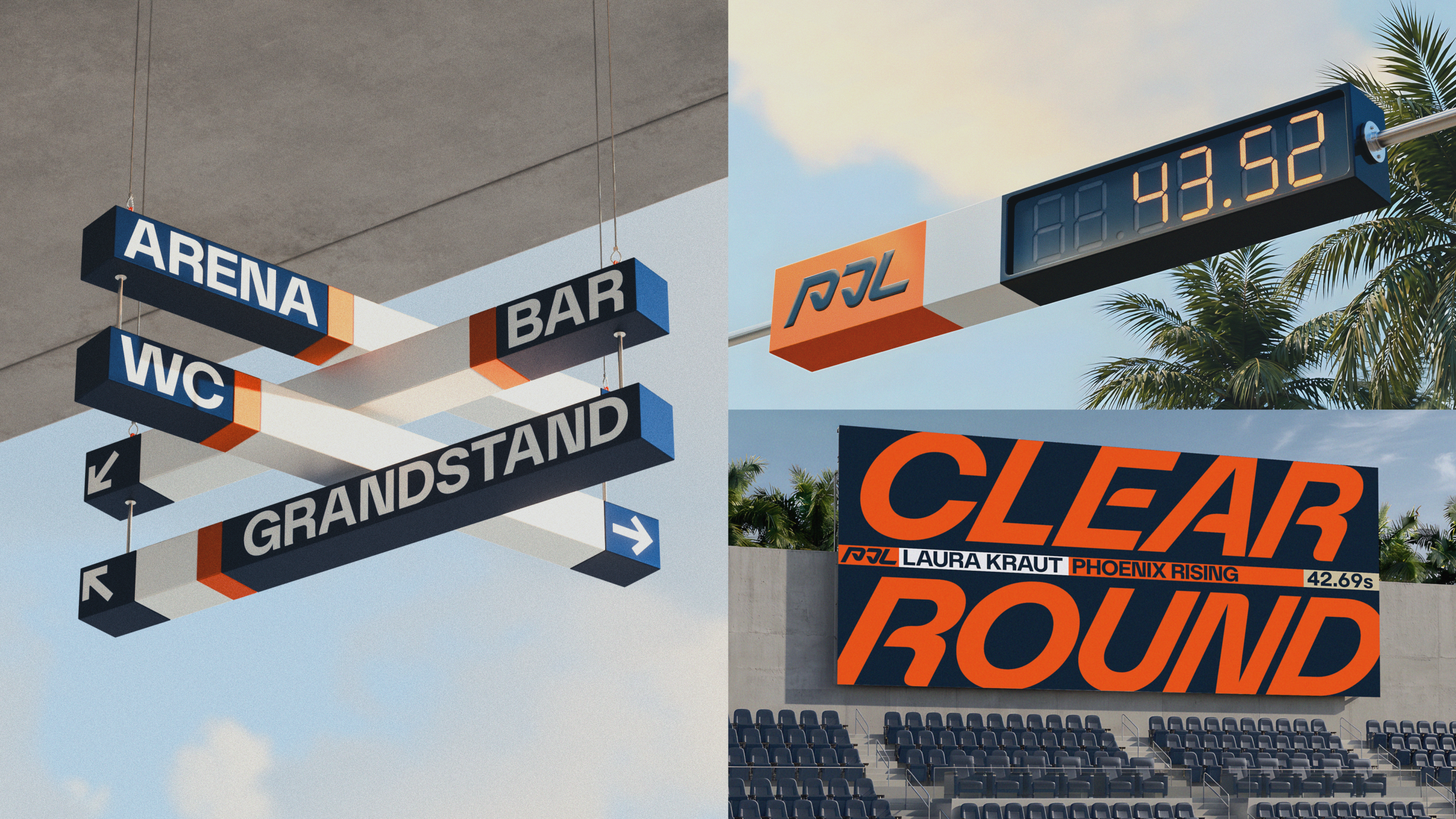
The identity system is built around the rail—the most iconic and functional object in jumping.
This is strategically smart for several reasons:
- It is instantly recognizable within the category
- It requires no explanation for insiders
- It becomes visually intriguing for newcomers
- It scales across digital, physical, motion, and merchandise
The rail acts as more than a graphic motif. It becomes a complete design language informing layout grids, typography, color blocking, motion systems, and image framing.
In branding terms, this creates a distinctive owned asset—something many modern sports properties lack.
Creative Execution: Athleticism Over Aristocracy
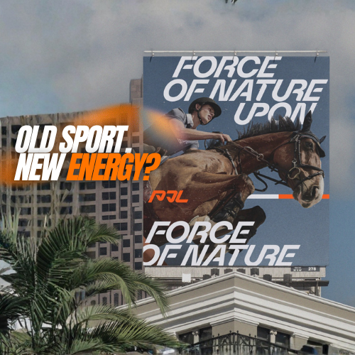
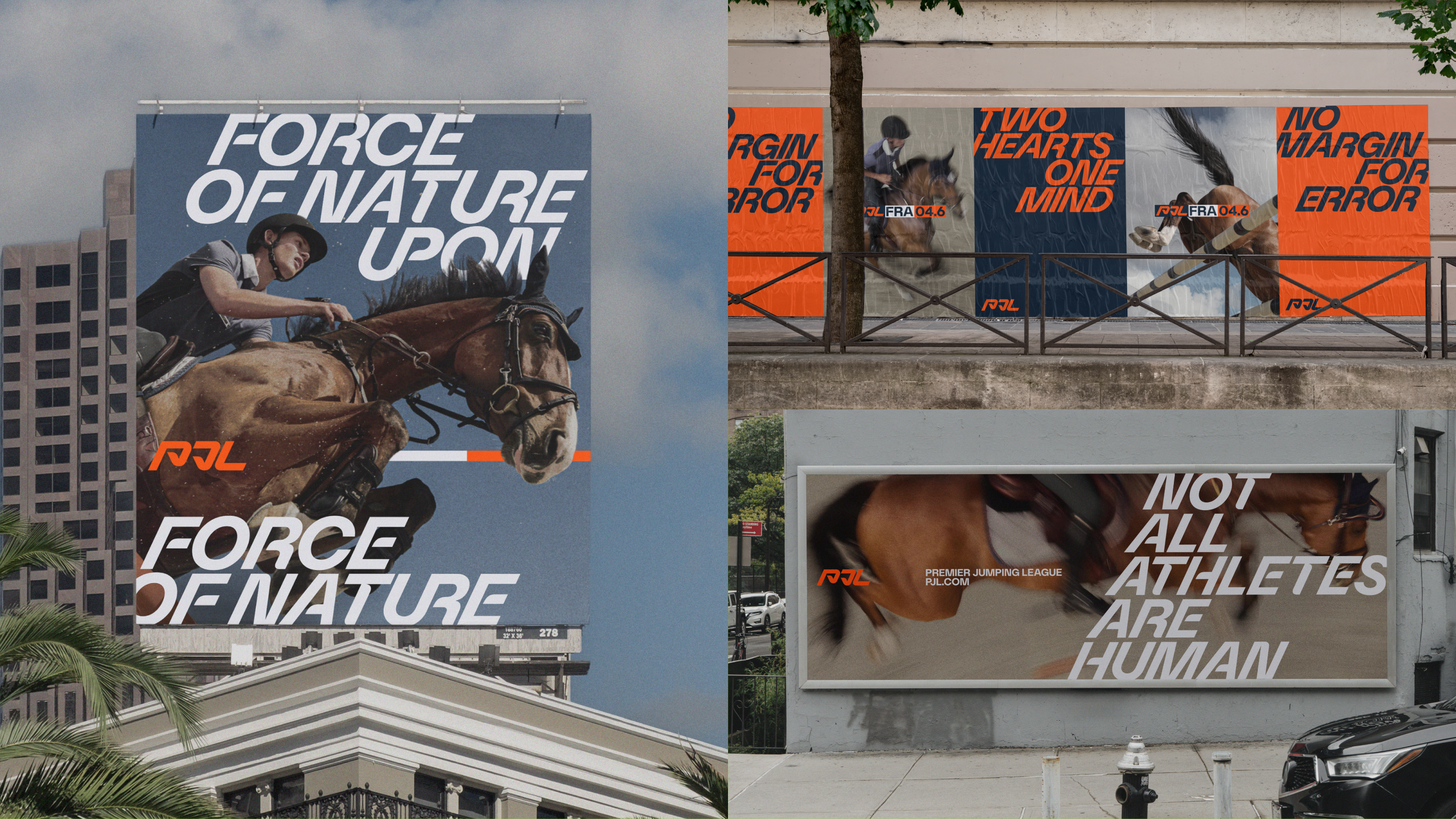
The new logo captures the pivotal moment a horse tucks its hooves to clear the rail. This choice moves the identity away from decorative equestrian tropes and toward athletic dynamism.
Tone of voice also plays a major role. Messaging such as:
- “Not all athletes are human”
- “This is not a show. This is a fight against gravity”
repositions the sport in more visceral, contemporary language.
Instead of emphasizing elegance or ceremony, the campaign highlights:
- Force
- Precision
- Trust
- Physics
- Competition
This reframing makes the sport feel closer to Formula 1, tennis, or UFC in intensity than to niche heritage entertainment.
Launch Film: Cinematic Access as Recruitment Tool
To launch the league, the campaign includes a cinematic film and image system created with photographer Daniel Benson and director Nicolina Knapp.
The production strategy focuses on proximity—bringing cameras closer than audiences typically experience the sport. Rare angles, airborne motion, muscle tension, and rider concentration turn competition into spectacle.
This matters because many sports grow when media technology reveals what was previously invisible.
Examples include:
- On-board cameras in motorsport
- Spidercam in football
- Slow motion in tennis
For jumping, intimate cinematography becomes the innovation layer.
OOH and Physical Media Potential: A System Built to Scale
Creative director Justin Hallström noted the rail asset can scale from merchandise to OOH. That is strategically significant.
Great sports brands need identities that work everywhere:
- Stadium signage
- Broadcast graphics
- Social media
- Tickets and invitations
- Apparel
- Billboards
The rail system appears built for exactly this. Its simplicity enables fast recognition while allowing endless variation.
For OOH specifically, bold linear forms and high-contrast composition can create immediate impact in crowded city environments.
Strategic Impact: Turning a Niche Category Into an Entertainment Property
The Premier Jumping League is not just launching a league—it is launching a category repositioning effort.
The move signals several broader trends in sports marketing:
- Legacy sports modernizing for younger audiences
- Identity systems designed for content ecosystems
- Emotional storytelling replacing institutional language
- Athletic truth replacing heritage clichés
If executed consistently, the brand can attract not only existing equestrian fans, but new viewers who previously dismissed the sport as inaccessible.
Final Reflection: When Branding Becomes Competitive Advantage
Many sports assume fandom comes purely from the game itself. Increasingly, that is no longer enough. Presentation matters. Narrative matters. Design matters.
The Premier Jumping League demonstrates how branding can function as infrastructure for growth—not cosmetic polish.
By centering the rail, elevating athletic intensity, and modernizing the language around the sport, PJL gives jumping something it has long needed: a brand system equal to the spectacle already happening in the arena.
Summary
Premier Jumping League partnered with NOT Wieden+Kennedy to create a bold visual identity and launch campaign that reframes show jumping as a modern spectator sport. Centered around the rail as a distinctive brand asset, the system transforms an often traditional category into a scalable, high-performance entertainment property.
Sources
FAQs
What is the campaign about?
It is the launch identity and brand campaign for the Premier Jumping League, a new global equestrian jumping competition.
Who created the branding?
The identity was created by NOT Wieden+Kennedy.
What makes it innovative?
It transforms the jumping rail into a scalable brand asset used across logo, typography, motion, OOH, and merchandise.
What was the strategic insight?
Show jumping already had elite athletic drama—it simply lacked modern presentation and accessible storytelling.
What channels were used?
The launch includes film, social media, website design, live event branding, merchandise applications, and future OOH potential.
FAQs about this campaign
What is the campaign about?
It is the launch identity and brand campaign for the Premier Jumping League, a new global equestrian jumping competition.
Who created the branding?
The identity was created by NOT Wieden+Kennedy.
What makes it innovative?
It transforms the jumping rail into a scalable brand asset used across logo, typography, motion, OOH, and merchandise.
What was the strategic insight?
Show jumping already had elite athletic drama—it simply lacked modern presentation and accessible storytelling.
What channels were used?
The launch includes film, social media, website design, live event branding, merchandise applications, and future OOH potential.
Bring your idea to breakfast-time OOH
Explore formats that meet audiences in morning routines and commuter corridors.

Comments
Be the first to comment.