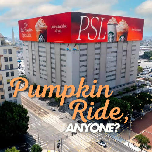
Starbucks launched one of New York’s most talked-about fall OOH moves: the L Line rolled out in PSL orange with the copy “PSL”, where the “L” is set as the subway icon—a smart, local wink to the Pumpkin Spice Latte.
Why does this transit idea work?
It’s simple and local. The typography speaks the subway’s visual language, making the message feel native to the commute. Seasonal orange dominates the platform, turning every stop into a PSL reminder.
Reach & frequency: the power of transit OOH
Full wraps add impressions on platforms, boardings, and station transfers. Same riders, multiple exposures throughout the day—frequency that converts into recall and seasonal sales.
Takeaway for brands
When the message integrates with context (local symbols, mobility codes), OOH compounds its effect. A precise typographic gesture can turn a train into a moving ad people want to photograph and share.
FAQs about this campaign
What did Starbucks do on NYC’s L Line?
It wrapped trains in a seasonal orange design and the copy “PSL,” using the ‘L’ as the subway icon to nod to Pumpkin Spice Latte.
Why is the subway ‘L’ usage clever?
It anchors the message to the location—borrowing local iconography so the copy feels native and more memorable.
What OOH format was used?
Transit advertising with full train wraps on the L Line, impacting platforms, boardings, and station interchanges.
What’s the advantage vs. static media?
Higher frequency and proximity: the same audience encounters the message multiple times a day, boosting recall and social sharing.
Bring your idea to breakfast-time OOH
Explore formats that meet audiences in morning routines and commuter corridors.
Comments
Be the first to comment.