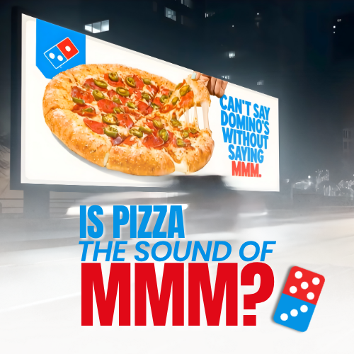
Domino’s is announcing its first brand refresh in 13 years—putting the “mmm” in “Dommmino’s” to make every touchpoint as craveable as what’s inside the box. The update introduces a playful, modern visual identity and a new brand platform and jingle—voiced by Shaboozey—designed for the next generation of pizza lovers. The iconic logo stays.
Why evolve now?
Most brands rebrand when they’re struggling. Domino’s is doing it after years of category-defying growth—aiming to be the best version of itself. Early testing is promising: 67% of consumers prefer the refresh over the former look.

Cravemark & jingle
Cravemark: Rather than adding a tagline, Domino’s bakes craveability into its name with “Dommmino’s.” The Cravemark also inspired a new jingle voiced by Shaboozey, giving the brand a fresh sonic identity.
Hotter colors & Domino’s Sans
Colors: The brand keeps its red and blue, dialed hotter and more energetic—like the center of a flame—and subtly nodding to the past.
Font: Domino’s Sans is a fully variable type family crafted for bold, personality-rich headlines. Circular details and semi-circles nod to pizza shapes; the wide range of weights/widths is as stretchable as dough.
Packaging built for culture
Boxes are Domino’s most prolific brand “prop,” redesigned to pop in social, at parties, and anywhere they land. Two pizza boxes placed back-to-back embody the logo. The black box for Pan and Parmesan Stuffed Pizzas now mirrors the core design in black and gold for a more indulgent feel.

Website & app made more craveable
Ordering platforms get a makeover: brighter reds/blues add vibrancy, while a softer tan replaces white to echo the heart of a pizza—its dough. The new look heroes upgraded food photography to heighten appetite appeal.
Rollout plan
Elements of the refresh begin rolling out now through next year, starting in the U.S. and select international markets, followed by a global expansion.
Why it matters for marketing & OOH
The refresh aligns visual, verbal, and sonic codes for clearer recall across every touchpoint—from packaging in the wild to OOH and digital. Strong distinctive assets (Cravemark, palette, type, jingle) amplify recognition and craveability at a glance.
FAQs about this campaign
What is changing in Domino’s brand refresh?
The Cravemark ‘Dommmino’s’, a new jingle voiced by Shaboozey, hotter color palette, Domino’s Sans type family, revamped packaging, and refreshed digital platforms.
Is Domino’s changing its logo?
No. The iconic Domino’s logo remains the same; the refresh updates how the brand looks, feels, and sounds around it.
Why refresh now?
After years of category-defying growth, Domino’s is evolving from a position of strength to stay the best version of itself.
What is the Cravemark?
A trademarked play on the name—‘Dommmino’s’—that bakes craveability directly into the brand’s identity and sonic assets.
When and where will it roll out?
Elements begin rolling out now through next year, starting in the U.S. and select international markets, then expanding globally.
Bring your idea to breakfast-time OOH
Explore formats that meet audiences in morning routines and commuter corridors.
Comments
Be the first to comment.