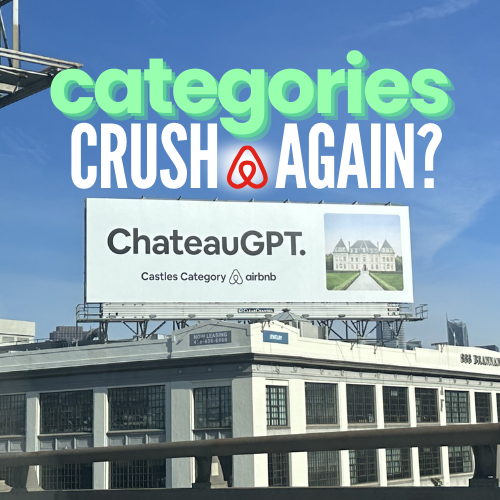
One of the defining OOH ideas of the decade? Airbnb’s “Categories”. It’s the rare mix of simple + systemic: big, unmistakable category headlines paired with arresting imagery—built to refresh forever. You said you’re glazing this campaign; honestly, same.
What’s the idea?
A modular template that showcases distinct types of stays—think Treehouses, Beachfront, Castles, OMG!—with a bold line and a hero visual. The message is obvious at a glance and intriguing enough to spark exploration.
Why it wins in OOH
OOH needs speed and simplicity. ‘Categories’ uses ultra-short copy and oversized assets for instant decode, whether you’re driving by a board or glancing up on transit. No overthinking—just see it, get it, want it.
Platform > one-off
The genius is repeatability. Swap the category and visual, keep the system. It localises to any market and stays fresh across seasons with light production lift—so you can “win the audience” again and again.
From glance to action
Clear categories convert curiosity into search and saves. By framing the product as a set of irresistible options, OOH does what it does best: plant a simple idea that the audience acts on later.
FAQs about this campaign
What is Airbnb’s ‘Categories’ campaign in OOH?
A modular platform using clear category headlines and hero imagery to spotlight distinct types of stays—built to refresh and scale across markets.
Why is it so effective outdoors?
It’s purpose-built for speed: minimal copy, bold assets, instant comprehension—perfect for billboards and transit.
How does it scale globally?
Swap category names and visuals to match local seasonality and interests without changing the core idea.
What can other brands learn?
Design platforms, not one-offs: create a simple template that’s easy to refresh and hard to ignore.
Bring your idea to breakfast-time OOH
Explore formats that meet audiences in morning routines and commuter corridors.