Quick Answer
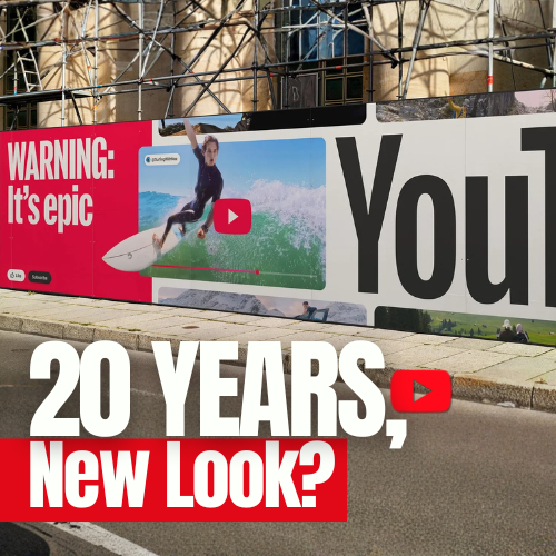
To celebrate its 20th anniversary, YouTube introduced a refreshed visual identity centered on motion, flexibility, and cultural relevance—evolving the brand without reinventing it.
What happened
When YouTube celebrated its 20th anniversary, the platform marked the milestone with a refreshed visual identity that reflects everything the brand has become—and everything it continues to be.
Founded in 2005 by Steve Chen, Chad Hurley, and Jawed Karim, YouTube began as a simple way to share videos at a time when watching online video was far from intuitive. The platform’s first upload, “Me at the Zoo,” symbolized a new era of digital expression.
Two decades later, YouTube has transformed into a global ecosystem spanning short-form content, music, live streaming, premium programming, and kids’ entertainment—serving billions of users worldwide. The challenge was clear: how do you remain relevant in an entertainment landscape that never stops moving?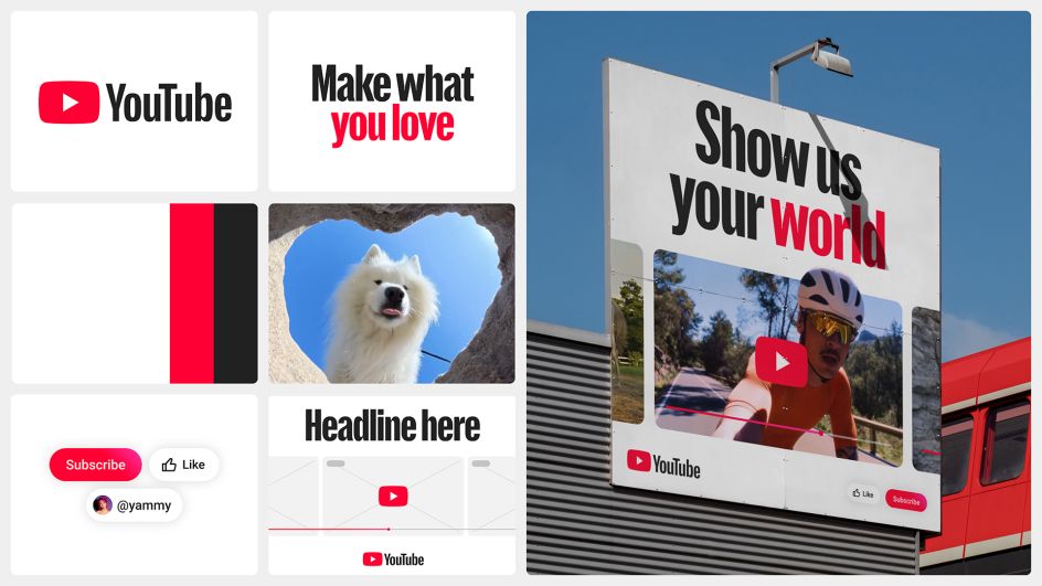
A brand built to stay relevant
Today’s entertainment world is fragmented. Platforms like TikTok, Twitch, Instagram, Kick, and streaming services have redefined how people consume content. YouTube’s response wasn’t to compete visually with every trend—but to create a system flexible enough to absorb them all.
The refreshed identity brings cohesion across YouTube, YouTube Music, YouTube Kids, and YouTube Premium while preserving each product’s personality. Instead of static rules, the system adapts—just like the content it hosts.
A living identity designed in motion
The defining feature of YouTube’s new identity is movement. Motion is no longer decorative—it’s foundational.
Inspired by real-world rhythms and behaviors, the system incorporates subtle camera vibrations, fluid transitions, and responsive animations that mirror how creators film, edit, and share content. This approach aligns with modern branding trends where motion design is essential for digital-first brands.
Rather than feeling polished or artificial, the motion feels human, spontaneous, and alive—echoing YouTube’s core promise of authentic expression.
Design elements that power the system
-
Color palette: Red, white, and black remain central, but now behave more expressively across interfaces and campaigns.
-
Interactive assets: Familiar UI elements like the play bar, subscribe button, and engagement icons are elevated as expressive brand assets.
-
Custom typography: YouTube Display, developed with Sharp Type, is inspired by the geometry of the original logo and adapted to nine writing systems—ensuring global consistency without sacrificing personality.
-
Illustrations: Created with Gesture Systems, the illustrations balance clarity and curiosity, using playful minimalism to reflect creator diversity and cultural range.
Together, these components form a system that feels cohesive across digital, physical, and experiential touchpoints.
Designed in-house, built with purpose
The entire identity was developed by YouTube Creative Studio, without the lead of an external agency. Strategic collaborations with Sharp Type and Gesture Systems supported specific elements, but the vision remained fully internal.
This approach allowed YouTube to stay deeply aligned with its product reality, user behavior, and long-term brand goals—resulting in a system that feels authentic rather than imposed.
Impact and design takeaways
The response to the new identity has been largely positive. Designers and brand experts have praised YouTube’s decision to evolve rather than reinvent, reinforcing its iconic status while modernizing its expression.
Key takeaways for designers and brands include:
-
Motion is no longer optional in digital branding
-
Flexible systems outperform rigid guidelines
-
Custom typography strengthens brand voice and ownership
-
Cohesion across sub-brands builds trust and clarity
YouTube’s 20th anniversary identity sets a benchmark for how legacy digital brands can evolve while staying unmistakably themselves. 
Summary
For its 20th anniversary, YouTube unveiled a renewed brand identity that embraces motion as its core design principle. Created entirely by YouTube Creative Studio, the system reflects how content, culture, and interaction live and evolve on the platform today.
Sources
FAQs
Why did YouTube update its brand identity for its 20th anniversary?
To reflect its evolution into a dynamic, multi-format entertainment ecosystem while maintaining brand consistency.
Who created YouTube’s new visual identity?
The identity was developed internally by YouTube Creative Studio.
What is the main concept behind the new identity?
A living system centered on motion, adaptability, and cultural relevance.
FAQs about this campaign
Why did YouTube update its brand identity for its 20th anniversary?
To reflect its evolution into a dynamic, multi-format entertainment ecosystem while maintaining brand consistency.
Who created YouTube’s new visual identity?
The identity was developed internally by YouTube Creative Studio.
What is the main concept behind the new identity?
A living system centered on motion, adaptability, and cultural relevance.
Bring your idea to breakfast-time OOH
Explore formats that meet audiences in morning routines and commuter corridors.

Comments
Be the first to comment.