Quick Answer
Skittles’ ‘Irritate the Rainbow’ is a minimalist OOH campaign featuring deliberately imperfect candy arrangements.
Cultural Context: Against the Era of Visual Perfection
In a marketing landscape dominated by hyper-polished product shots and algorithm-optimized aesthetics, Skittles moves in the opposite direction. The confectionery category typically leans into symmetry, gloss and appetite appeal.
‘Irritate the Rainbow’ challenges that visual orthodoxy. Instead of presenting neatly arranged, flawless candy compositions, the campaign introduces subtle but deliberate imperfections.
The tension is immediate. The posters look almost correct. That “almost” is the idea.

The Strategic Insight: Irritation Drives Attention
The core insight is behavioral. Humans are wired to detect pattern disruption. A small inconsistency in an otherwise orderly arrangement creates cognitive friction.
Skittles leverages that friction as a media strategy.
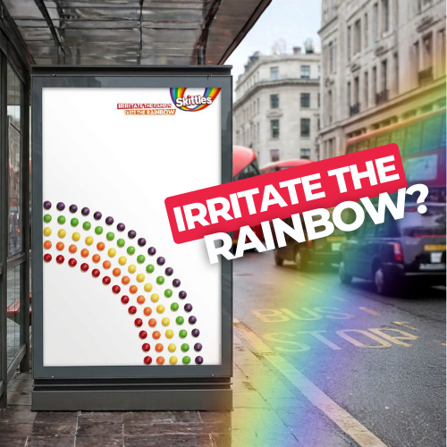
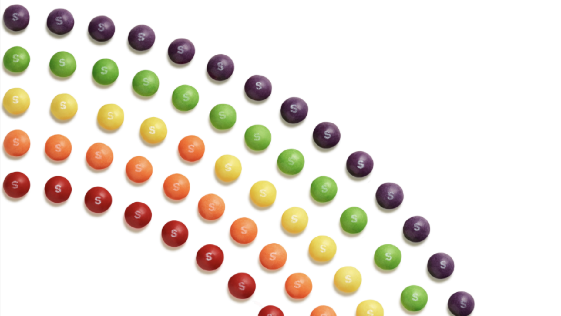
Each of the three minimalist posters features rainbow-coloured candies arranged into geometric formations. On closer inspection, a few pieces are misaligned. The result is mild irritation paired with amusement.
Rather than shouting for attention, the work earns it through visual discomfort. In OOH—where dwell time is short—this micro-moment of disruption increases stopping power.

Media and Creative Execution: Minimalism With Intent
Shot by photographer James Day, the executions are stripped back. White backgrounds. Bold colour. No excessive copy.
This restraint is strategic. The simplicity amplifies the imperfections. If the layout were busy, the disruption would be diluted.
By subverting conventional product beauty, Skittles reinforces its irreverent tone within the broader ‘Taste the Rainbow’ platform. The campaign does not introduce a new brand voice; it sharpens an existing one.
Strategic Reflection: Distinctiveness Over Decoration
‘Irritate the Rainbow’ reflects a wider shift toward distinctive brand assets and anti-perfection aesthetics. Where many brands compete for aesthetic approval, Skittles competes for reaction.
The posters are not designed to be admired. They are designed to be noticed.
In doing so, Skittles demonstrates that OOH effectiveness does not require scale alone. It requires tension. By engineering imperfection, the brand turns irritation into memorability—proving that sometimes the most effective visual strategy is to intentionally get it wrong.
Summary
Skittles launched ‘Irritate the Rainbow,’ a visually disruptive outdoor campaign developed by adam&eve\TBWA. As part of the global ‘Taste the Rainbow’ platform, the work replaces product perfection with calculated imperfection to provoke attention and reinforce brand distinctiveness.
Sources
FAQs
What is ‘Irritate the Rainbow’?
It is an OOH campaign featuring deliberately imperfect Skittles arrangements to provoke attention and amusement.
Who created the campaign?
The work was developed by adam&eveTBWA for Skittles.
What makes it innovative?
It uses calculated visual imperfection as a strategic device to increase memorability in outdoor advertising.
What platform does it belong to?
The campaign is part of Skittles’ global ‘Taste the Rainbow’ brand platform.
FAQs about this campaign
What is ‘Irritate the Rainbow’?
It is an OOH campaign featuring deliberately imperfect Skittles arrangements to provoke attention and amusement.
Who created the campaign?
The work was developed by adam&eveTBWA for Skittles.
What makes it innovative?
It uses calculated visual imperfection as a strategic device to increase memorability in outdoor advertising.
What platform does it belong to?
The campaign is part of Skittles’ global ‘Taste the Rainbow’ brand platform.
Bring your idea to breakfast-time OOH
Explore formats that meet audiences in morning routines and commuter corridors.

Comments
Be the first to comment.