Quick Answer
Hi*Ball has entered the UK market with a new identity created by London-based agency Founders Makers. Rather than simply bringing the American brand across unchanged, the agency rebuilt the positioning, packaging and go-to-market strategy around the platform “refresh your energy,” presenting Hi*Ball as a sparkling energy water designed for British consumers.
Creative Context: Hi*Ball Crosses the Atlantic
US drink brand Hi*Ball has entered the UK market with a new identity designed by London-based creative agency Founders Makers.
Owned by Tilray Brands, the launch marks Hi*Ball’s first move outside the United States.
It also represents the first step in a planned global expansion for the brand.
Rather than simply transferring the existing American identity into a new market, Founders Makers rebuilt the brand from the ground up.
The agency reshaped the positioning, packaging and go-to-market strategy to make Hi*Ball feel relevant to British consumers.
Brand Challenge: Creating Space in a Crowded Category
Hi*Ball sits between two established beverage territories.
It is lightly flavoured and sparkling, but it also contains natural caffeine and functional ingredients.
That created a strategic challenge for Founders Makers.
The agency needed to make the product’s dual nature immediately clear without forcing it into familiar category language.
Notably, the word “seltzer” is absent from the new branding and packaging.
Market Strategy: Relevance Over Direct Translation
Hi*Ball already had a loyal following in the US, but the agency recognized that success in one market does not automatically translate to another.
The UK launch required a different approach.
Founders Makers focused on understanding what would make the brand feel meaningful, clear and appealing for British consumers.
This shift is important because beverage categories are shaped heavily by local habits, language and shelf expectations.
The result is not a copy of the American brand, but a UK-ready version of Hi*Ball.
Product Positioning: Sparkling Energy Water
The new brand platform is built around the line “refresh your energy.”
This positions Hi*Ball as a bridge between functional drinks and sparkling flavoured drinks.
The descriptor “sparkling energy water” plays a central role in the identity.
It makes the product’s dual function easy to understand: refreshing like sparkling water, but with the energy benefit consumers expect from caffeine.
This clarity helps Hi*Ball avoid the visual and verbal clichés of traditional energy drinks.
Functional Benefit Without Energy Drink Stereotypes
Hi*Ball is a clear, lightly flavoured sparkling drink containing natural caffeine sourced from guarana and ginseng, alongside B vitamins.
It contains zero sugar, zero sweeteners, zero calories and zero preservatives.
Although the drink carries as much caffeine as a flat white, the brand wanted to communicate performance in a cleaner and more premium way.
That meant avoiding the loud, aggressive codes often associated with energy drink branding.
Instead, the new identity presents energy as light, clear and refreshing.
Flavour Strategy: Built Around UK Consumer Research
Consumer research informed the development of the UK flavour line-up.
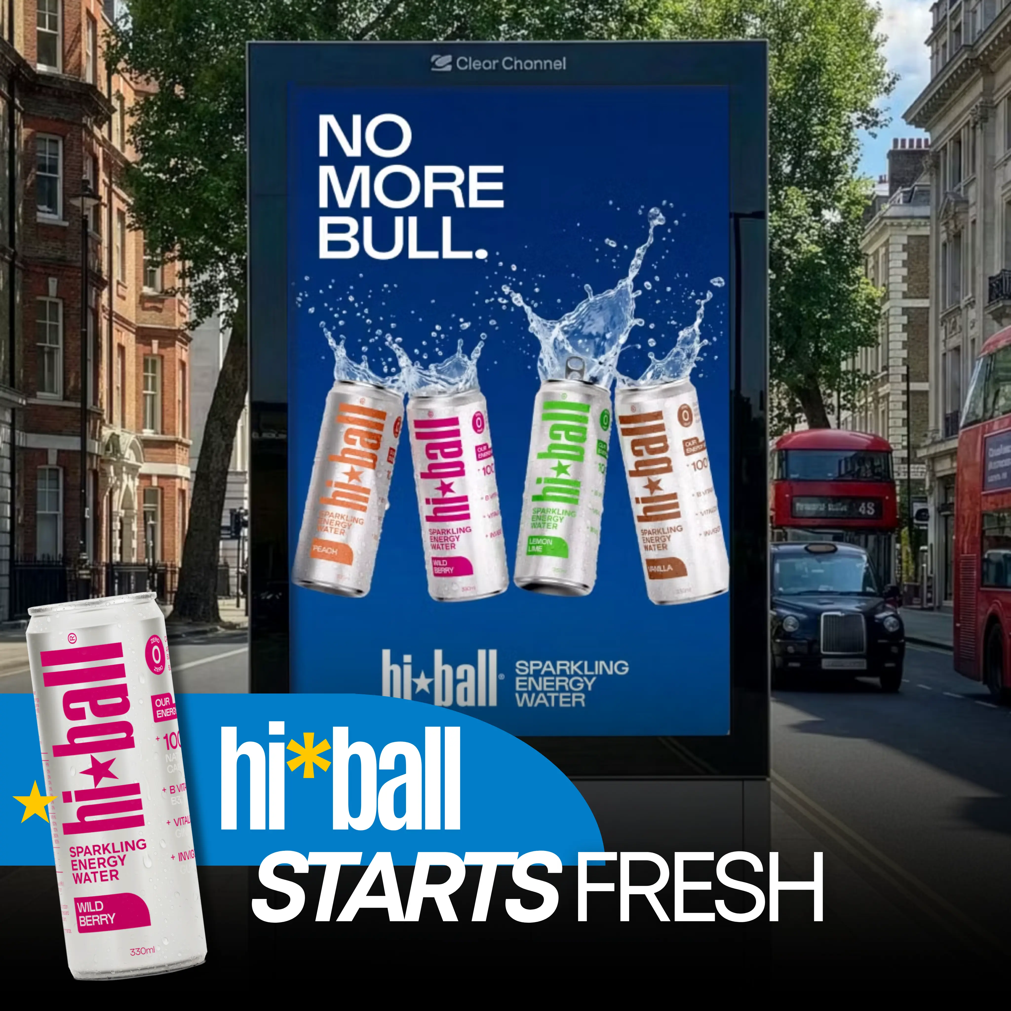
The launch range includes peach, wild berry, lemon lime and vanilla.
Each flavour is supported by bright single-colour coding across the packaging system.
This helps the range feel easy to navigate on shelf while giving every variant its own distinct visual personality.
The flavour strategy makes the brand feel approachable while still maintaining a premium identity.
Packaging Redesign: A Cleaner, More Premium Can
Founders Makers redesigned the packaging for the UK market, moving away from the bulkier US format.
The new can silhouette is cleaner and more premium, designed to stand apart on British shelves.
A silver, near-transparent base references the clarity of the liquid inside.
The Hi*Ball wordmark and star device form the center of the visual system.
The result is packaging that feels functional, refreshing and elevated at the same time.
Visual Identity: The Power of the Zero
A prominent “0” appears across the identity to highlight the brand’s zero-sugar and zero-sweetener proposition.
This detail gives the packaging a clear functional cue without overwhelming the design.
It helps consumers quickly understand one of the product’s biggest benefits.
At the same time, the overall look avoids feeling clinical or overly technical.
The identity balances performance credibility with a cleaner lifestyle-led appearance.
Digital OOH and Launch Applications
The new identity has been designed as a flexible system that extends beyond packaging.
Applications include digital, social, retail environments, sampling units, community partnerships and digital OOH.
For a new market launch, this flexibility matters.
Hi*Ball needs to build recognition quickly across multiple consumer touchpoints.
Digital OOH gives the brand a public-facing way to introduce its new look, flavour range and sparkling energy water positioning at scale.
Category Context: A Growing Appetite for Functional Refreshment
The campaign arrives as sparkling and functional drinks continue to gain attention in the UK market.
Recent launches from brands such as Gaptooth Soda and Dickie’s Ginger show growing demand for drinks that feel more interesting than traditional soft drinks.
Hi*Ball enters this space by combining refreshment, light flavour and natural caffeine.
This gives the brand a clear role for consumers looking for energy without the heaviness or intensity of conventional energy drinks.
Global Expansion: The UK as a Blueprint
The UK launch will also serve as a blueprint for Hi*Ball’s future expansion.
The brand is expected to roll out into European, Middle Eastern and Asia-Pacific markets over time.
That makes the new identity especially important.
It is not only solving a UK launch challenge; it is creating a flexible foundation for international growth.
The clearer the positioning now, the easier it becomes to scale the brand into new markets later.
Why the Rebrand Works
The rebrand works because it gives Hi*Ball a sharper and more market-ready role.
First, it avoids confusing category language and replaces it with the clearer descriptor “sparkling energy water.”
Second, it creates a packaging system that feels lighter, more premium and easier to navigate.
Third, it communicates functional benefits without relying on traditional energy drink codes.
Finally, the identity is flexible enough to work across retail, sampling, social, digital and digital OOH environments.
Final Reflection: Refreshing Energy for a New Market
Hi*Ball’s UK launch shows how a successful American brand can adapt without losing its core product idea.
Founders Makers did not simply translate the existing identity for a new audience.
The agency rebuilt the brand around clarity, refreshment and functional energy.
By positioning Hi*Ball as sparkling energy water, the work creates a more distinctive place for the product in a crowded drinks category.
For the UK market, the message is simple.
Energy does not have to feel heavy, loud or artificial.
It can be clear, sparkling and refreshed.
Summary
Owned by Tilray Brands, Hi*Ball’s UK launch marks the American drink brand’s first move outside the US and the beginning of a planned global expansion. Founders Makers reimagined the brand from the ground up, avoiding the word “seltzer” and instead positioning the drink as “sparkling energy water.” The new identity features a refined can silhouette, bright flavour coding, a silver near-transparent base and a prominent “0” to highlight zero sugar, sweeteners, calories and preservatives. The system extends across packaging, digital, social, retail, sampling, community partnerships and digital OOH.
Sources
FAQs
What is Hi*Ball?
Hi*Ball is a clear, lightly flavoured sparkling energy water containing natural caffeine from guarana and ginseng, plus B vitamins.
Who redesigned Hi*Ball for the UK?
The UK identity, packaging and positioning were created by London-based creative agency Founders Makers.
What is Hi*Ball’s new brand platform?
The new platform is “refresh your energy,” positioning Hi*Ball as a bridge between functional drinks and sparkling flavoured drinks.
Why does the packaging emphasize zero?
The prominent “0” highlights that Hi*Ball contains zero sugar, zero sweeteners, zero calories and zero preservatives.
FAQs about this campaign
What is Hi*Ball?
Hi*Ball is a clear, lightly flavoured sparkling energy water containing natural caffeine from guarana and ginseng, plus B vitamins.
Who redesigned Hi*Ball for the UK?
The UK identity, packaging and positioning were created by London-based creative agency Founders Makers.
What is Hi*Ball’s new brand platform?
The new platform is “refresh your energy,” positioning Hi*Ball as a bridge between functional drinks and sparkling flavoured drinks.
Why does the packaging emphasize zero?
The prominent “0” highlights that Hi*Ball contains zero sugar, zero sweeteners, zero calories and zero preservatives.
Bring your idea to breakfast-time OOH
Explore formats that meet audiences in morning routines and commuter corridors.

Comments
Be the first to comment.